


Climatic Summary Plots and Table Descriptions
Description of NDBC Climate Plots
Mean and Standard Deviation Plots
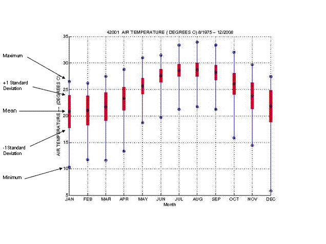
The top blue dot-within-the-circle indicates the maximum value for the month. The top of the red bar indicates the value of one (1) Standard Deviation above the Mean Value. The bottom blue dot-within-the-circle indicates the Minimum Value. The blue dot-within-the circle in the middle of the red bar indicates the Mean or Average value. The bottom of the red bar indicates the value one (1) Standard Deviation below the Mean Value.
Quartile Plots
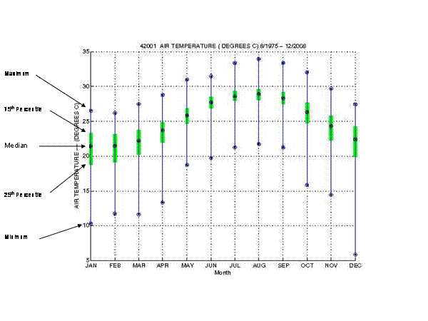
The top blue dot-within-the-circle indicates the maximum value for the month. The top of the green bar indicates the value of 75th Percentile. The bottom blue dot-within-the-circle indicates the Minimum Value. The blue dot-within-the circle in the middle of the green bar indicates the Median or 50th Percentile. The bottom of the green bar indicates the value of the 25th Percentile.
Description of Tables
The following tables are in order of appearance in the Table file. For a description of the elements, see the Measurements Description and Units webpage.
- 1-MONTHLY AND ANNUAL FREQUENCY AND CUMULATIVE PERCENT FREQUENCY (10THS), for each the following measurements:
- AIR TEMPERATURE (DEGREES C)
- SEA TEMPERATURE (DEGREES C)
- AIR - SEA TEMPERATURE (DEGREES C): Difference between the reported values (Air Temperature minus Sea Surface Temperature)
- DEW POINT TEMPERATURE (DEGREES C)
- AIR - DEW POINT TEMPERATURE (DEGREES C): Difference between the reported values (Air Temperature minus Dew Point Temperature)
- SEA LEVEL PRESSURE (MILLIBARS)
- AVERAGE WIND SPEED (KNOTS)
- PEAK WIND GUST (KNOTS, HIGHEST 5-SECOND AVERAGE DURING 2 OR 8-MINUTE PERIOD PRIOR TO OBSERVATION TIME)
- HOURLY PEAK WIND GUST (KNOTS, HIGHEST 5-SECOND AVERAGE DURING PAST HOUR)
- SIGNIFICANT WAVE HEIGHT (METERS)
- AVERAGE WAVE PERIOD (SECONDS)
- DOMINANT WAVE PERIOD (SECONDS)
- 2-MEANS & EXTREMES BASED ON HOURLY (GMT) OBSERVATIONS -- MONTHLY & ANNUAL BY YEAR, for each of the following measurements:
- AIR TEMPERATURE (DEGREES C)
- SEA TEMPERATURE (DEGREES C)
- DEW POINT TEMPERATURE (DEGREES C)
- SEA LEVEL PRESSURE (MILLIBARS)
- AVERAGE WIND SPEED (KNOTS)
- PEAK WIND GUST (KNOTS, HIGHEST 5-SECOND AVERAGE DURING 2 OR 8-MINUTE PERIOD PRIOR TO OBSERVATION TIME)
- HOURLY PEAK WIND GUST (KNOTS, HIGHEST 5-SECOND AVERAGE DURING PAST HOUR)
- SIGNIFICANT WAVE HEIGHT (METERS)
- Joint Distributions for each month, for all months, and each season (Winter, Spring, Summer, and Autumn) for the each of the following measurements:
- 3-AVERAGE WIND SPEED (KNOTS) VS AVERAGE WIND DIRECTION (TENS OF DEGREES)
- 4-PERCENT FREQUENCY OF AVERAGE WIND SPEED (KNOTS) VS SIGNIFICANT WAVE HEIGHT (METERS)
- 5-PERCENT FREQUENCY OF SIGNIFICANT WAVE HEIGHT (METERS) VS DOMINANT WAVE PERIOD (SECONDS)
- 6-SIGNIFICANT WAVE HEIGHT (METERS) VS AVERAGE WAVE PERIOD (SECONDS)
- 7-DOMINANT WAVE PERIOD (SECONDS) VS MEAN WAVE DIRECTION1 (TENS OF DEGREES)
- 8-SIGNIFICANT WAVE HEIGHT (METERS) VS MEAN WAVE DIRECTION (TENS OF DEGREES)